We built the brand from the foundation beginning with audience clarity, tone of communication, colour direction, and message structure.
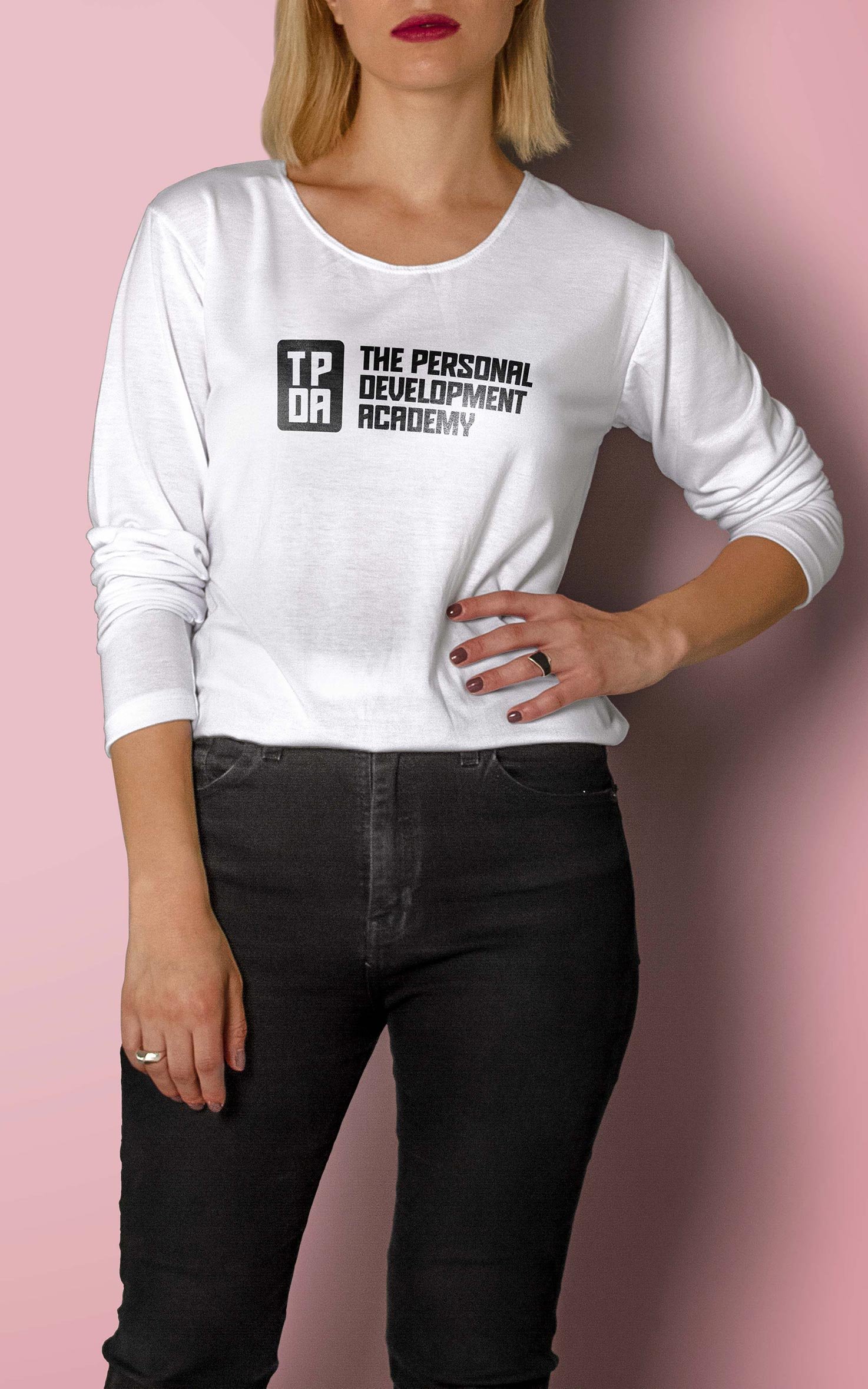
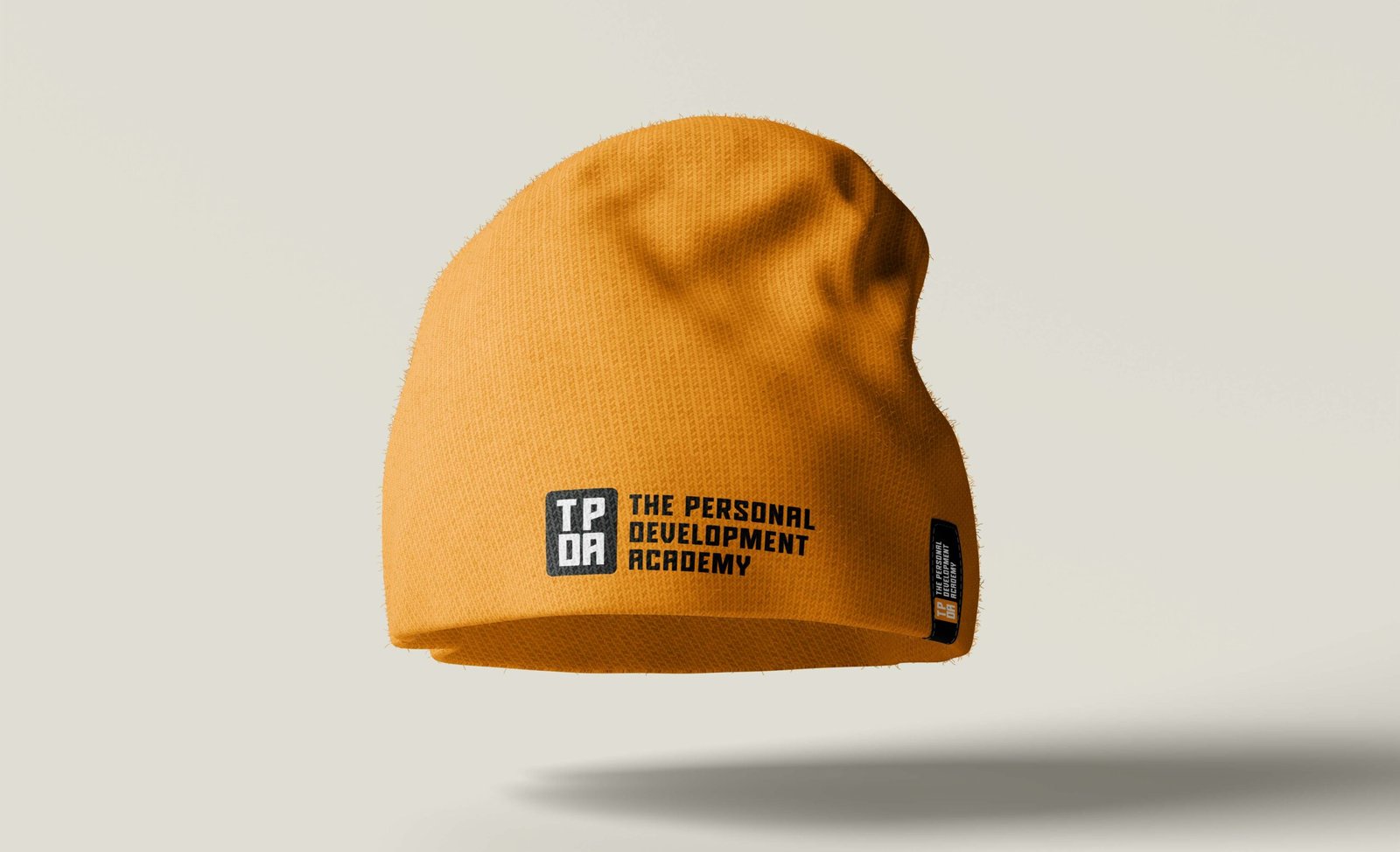
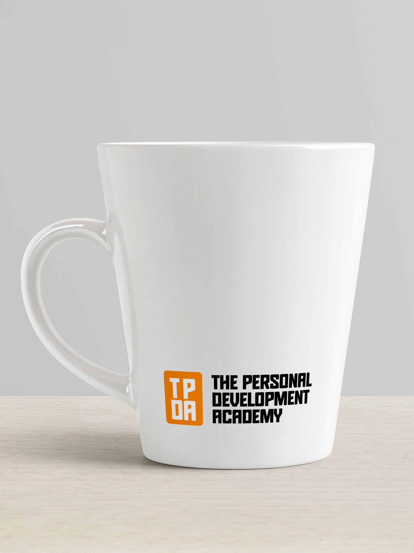
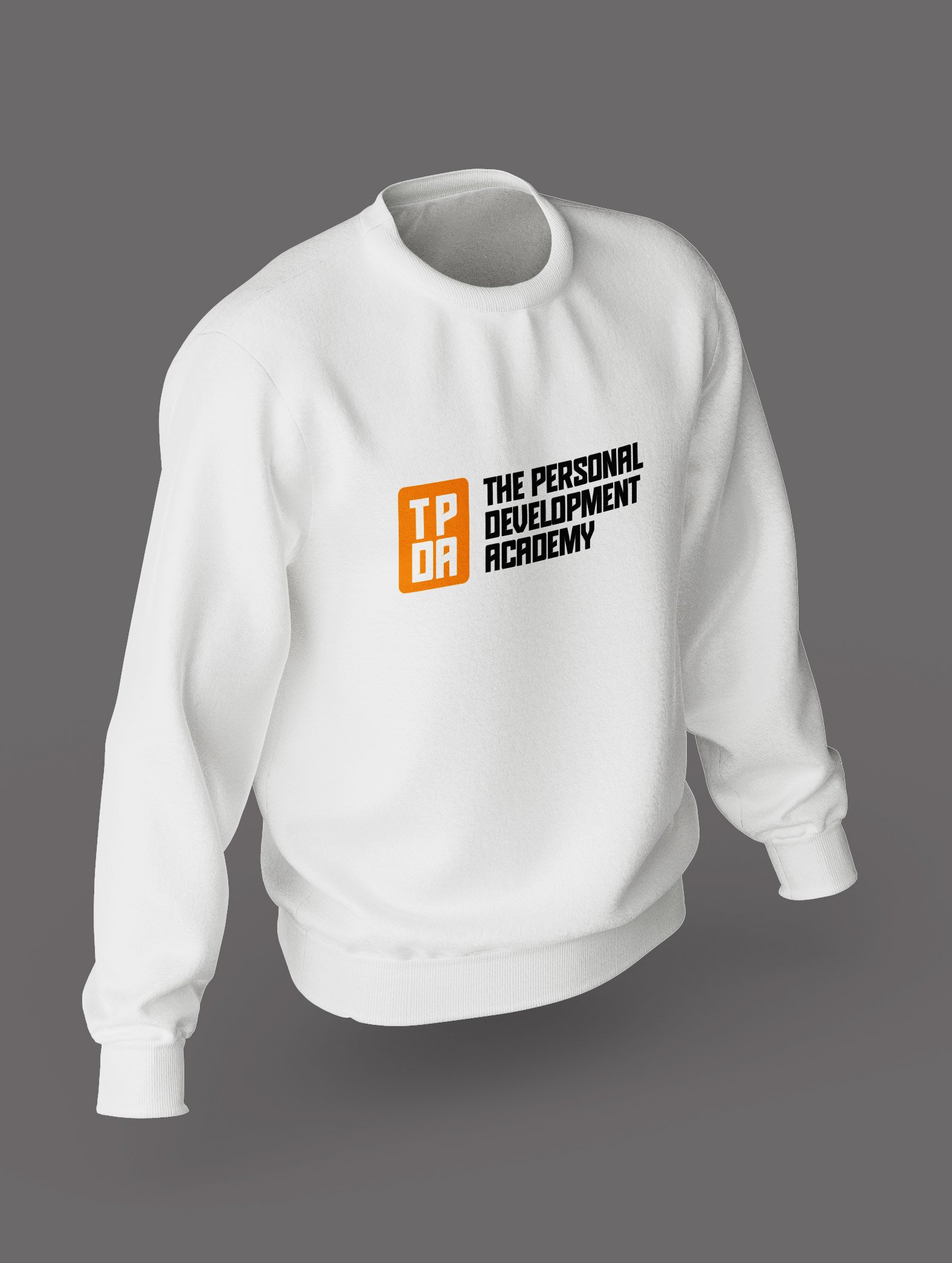
The visual identity was designed to feel warm, empowering and student-focused, with typography and colour choices that communicate support, clarity and growth.
Once the identity was approved, we moved into web development. The website was crafted to speak clearly to students and young adults, with simple navigation, human-centered messaging, and a structure designed for marketing campaigns and enrollment funnels. Every page was written to emphasize transformation, not just education.