Industry
FinTech / Telecommunication
Project
User Interface Design
Core Audience
The redesign was informed by the needs of users with different levels of digital experience and different patterns of Mobile Money usage.

Fast. Clear. Made for everyday money moments.

MTN Mobile Money is deeply embedded in everyday life across Ghana, but its interface had not fully evolved with the expectations of today’s digital-first users.

Research revealed friction across navigation, visual clarity, and task flow, particularly for first-time users, market traders, and less tech-savvy customers. While users valued speed and trust, the experience could feel busy and inconsistent.

Our Approach

We began by mapping key user journeys across everyday users, merchants, and high-frequency traders to understand where interactions became difficult or slowed down.

Stakeholder sessions and interface audits helped identify points of friction, drop-off, and unnecessary complexity across core tasks.

We then:

  • Analysed navigation patterns to identify where users struggled to find essential functions. Reviewed core task flows across Send, Receive, Pay, and Withdraw to uncover unnecessary steps. Studied information hierarchy to determine what users needed to see first and what could be simplified.
  •  
  • Evaluated the existing interface system for inconsistencies in layouts, icons, labels, and interaction patterns. Prioritised user needs around speed, clarity, familiarity, and trust.
  • Explored clearer ways to surface frequent actions without disrupting the established MTN experience.
  •  
  • Considered real Ghanaian usage conditions, including low connectivity and high-frequency transaction environment.

The Solution & Results

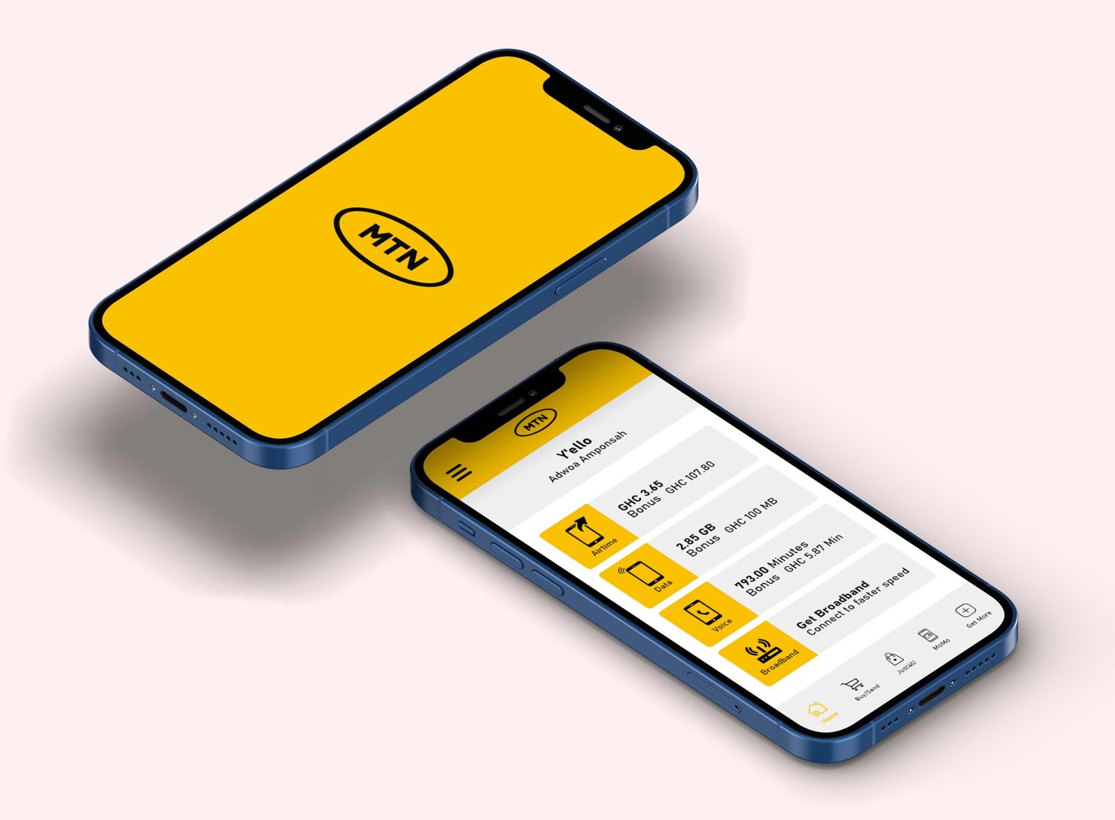
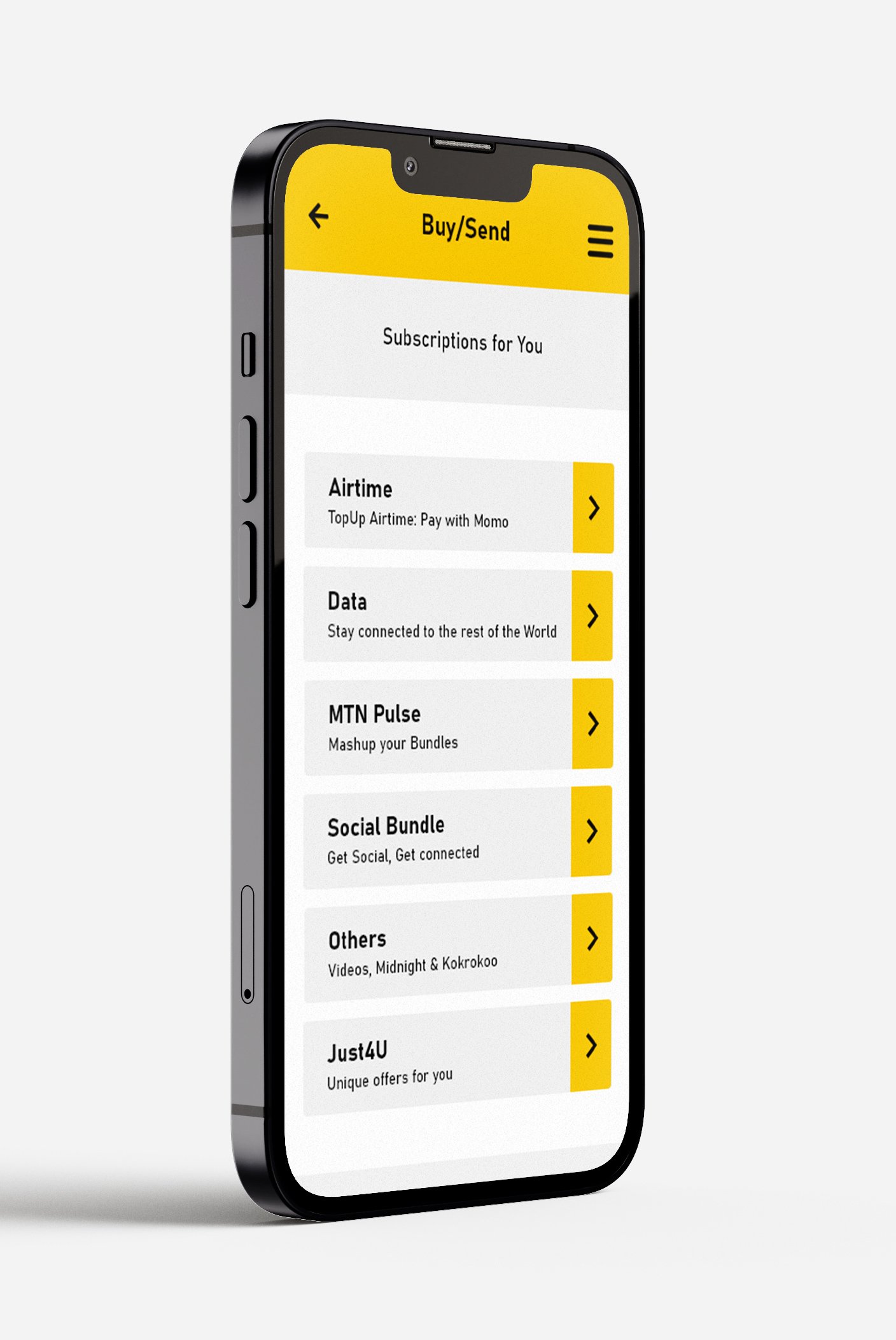
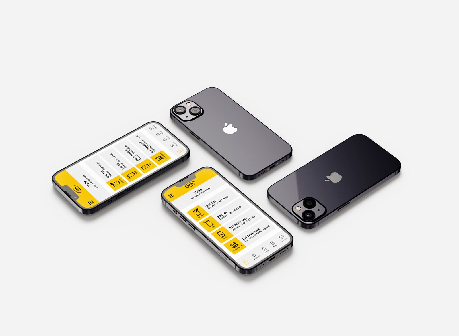
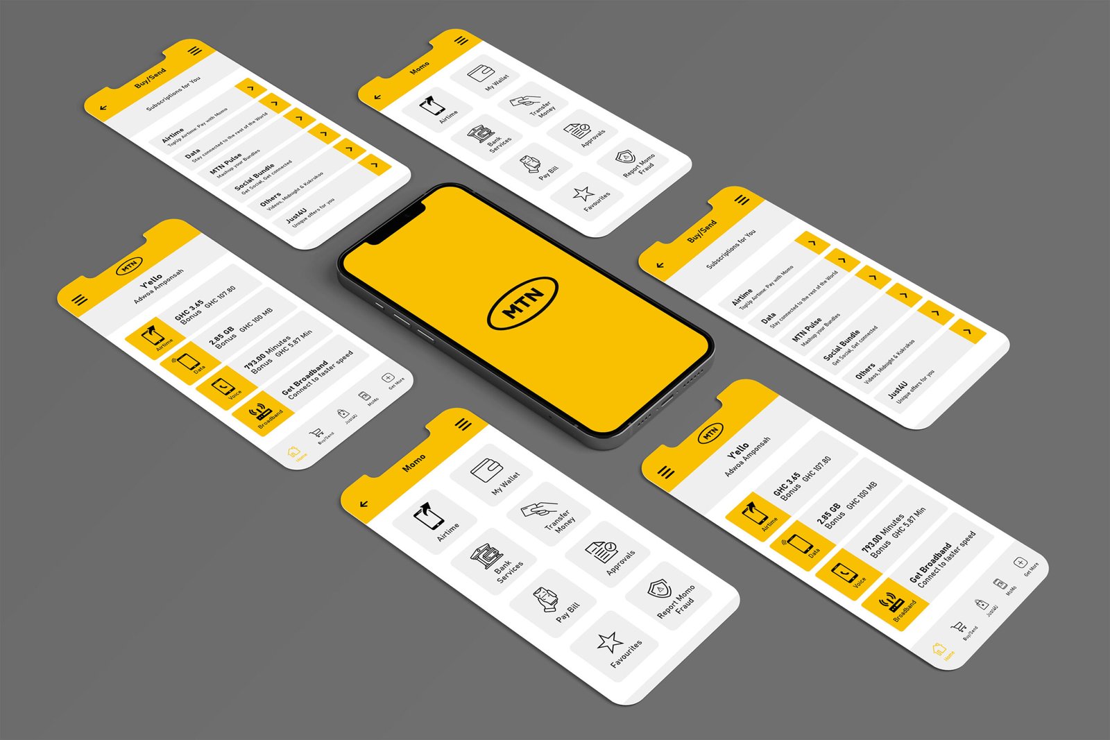
The redesign focused on one clear principle: make everyday transactions simpler. Core actions such as Send, Receive, Pay, and Withdraw were prioritised through clearer hierarchy, simplified layouts, intuitive iconography, and more consistent interaction patterns, while retaining MTN’s familiar yellow, black, and white visual language.

Prototypes were tested against real Ghanaian usage scenarios, including low-connectivity environments and varying levels of digital literacy, helping refine the experience around how users actually navigate and complete tasks.

The result is a clearer, faster, and more familiar Mobile Money experience, simplifying the transaction while strengthening user confidence and trust.

© 2022 – 2026

All rights reserved