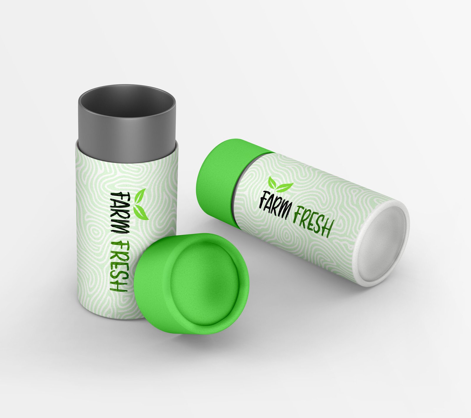
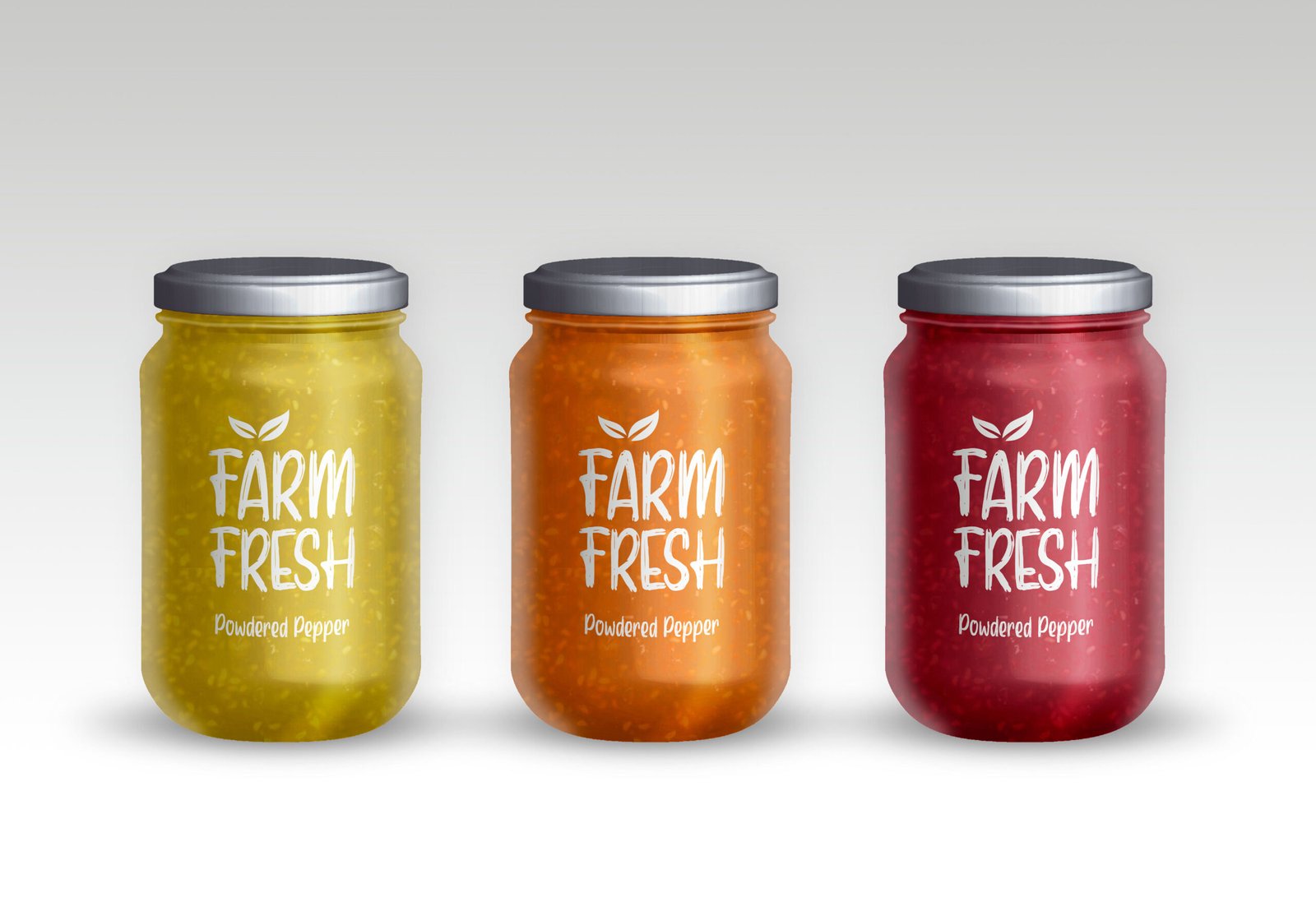
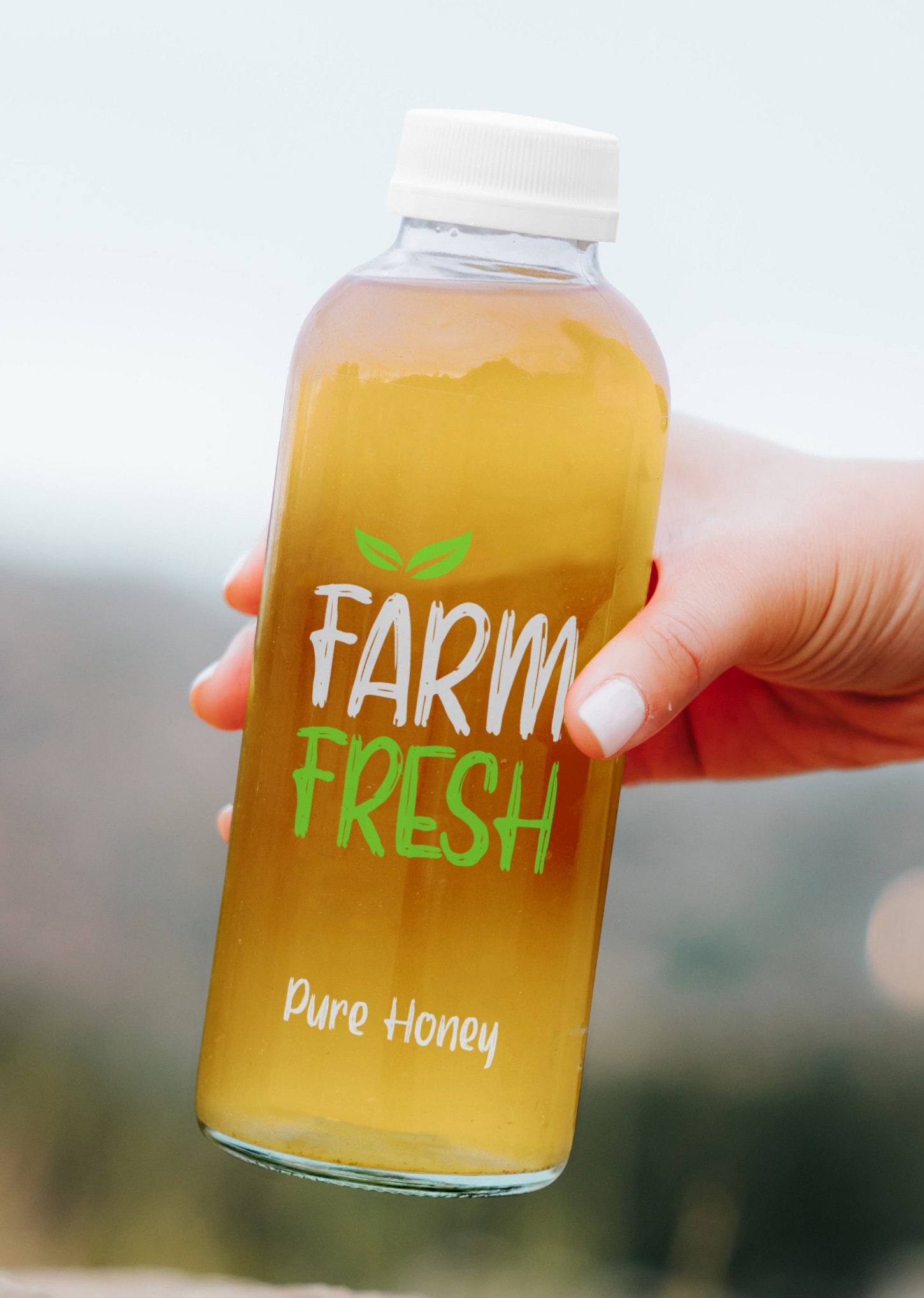
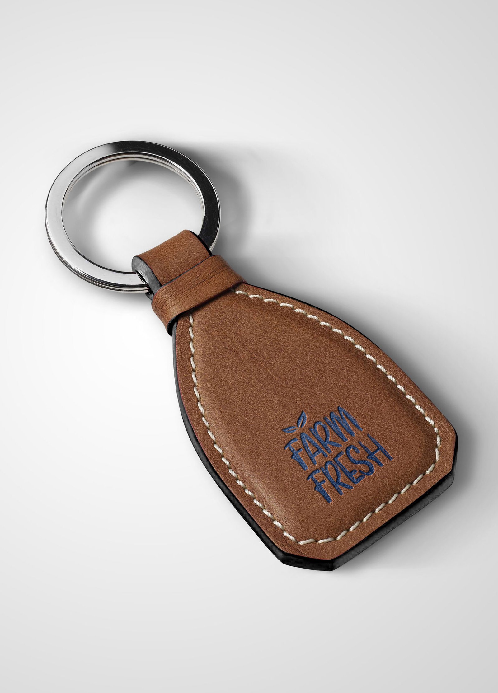
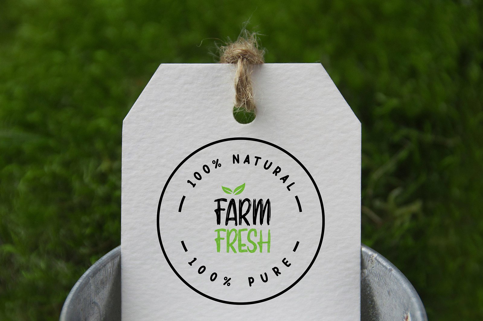
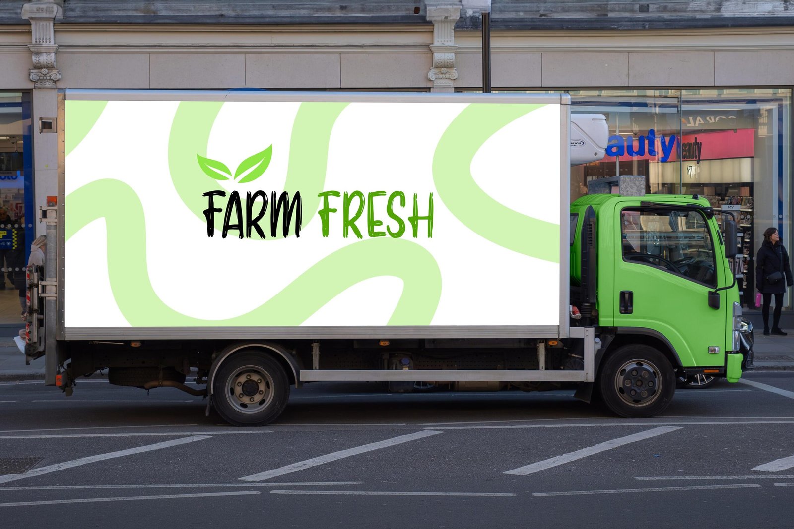
Our research showed that customers associate freshness with simplicity, clarity, and natural cues. Working closely with the client and following their suggestion we incorporated a green leaf into the logo to symbolize the direct connection to the farm.
The identity was designed to feel friendly and approachable, while the packaging was kept clean and minimal to ensure strong shelf visibility.
Green was chosen as the primary color to reinforce agriculture, freshness, and sustainability.