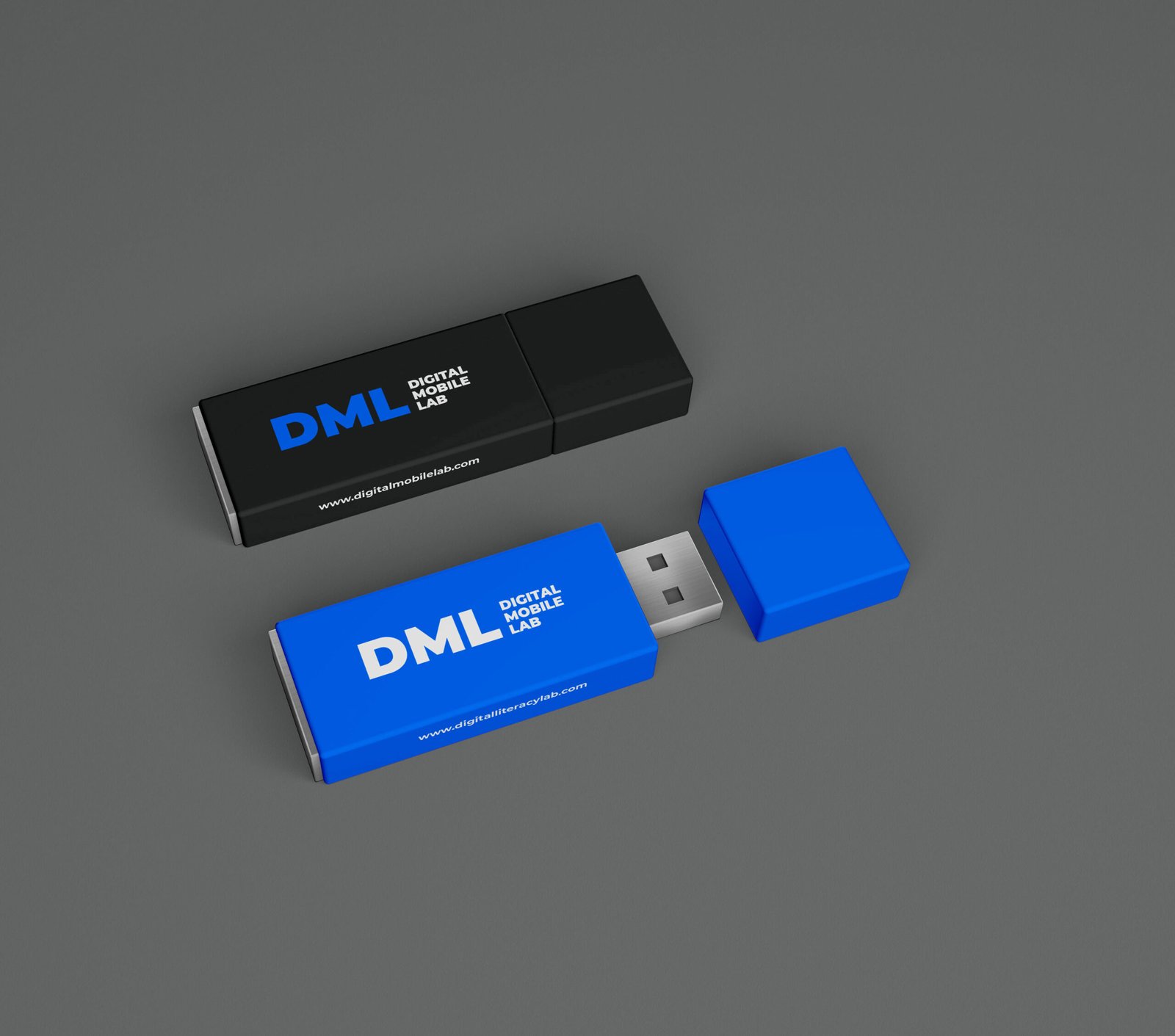
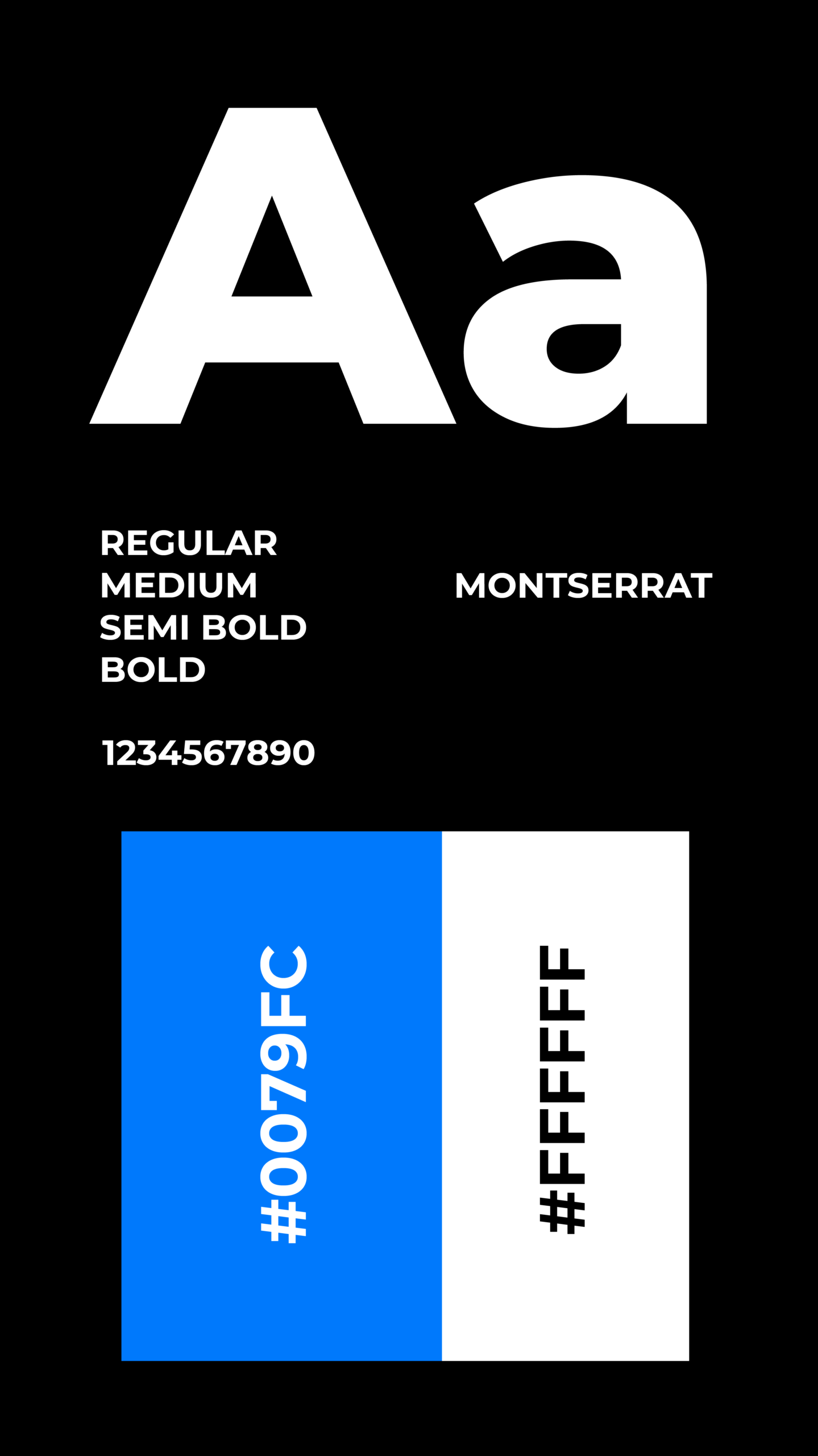
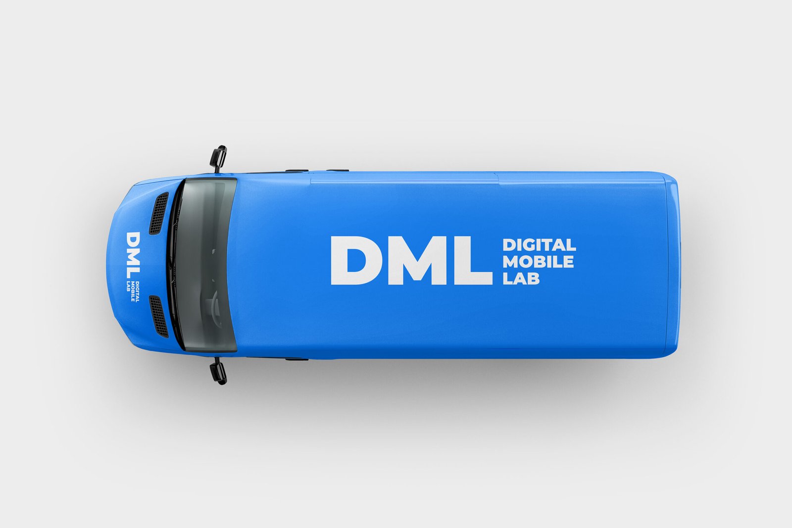
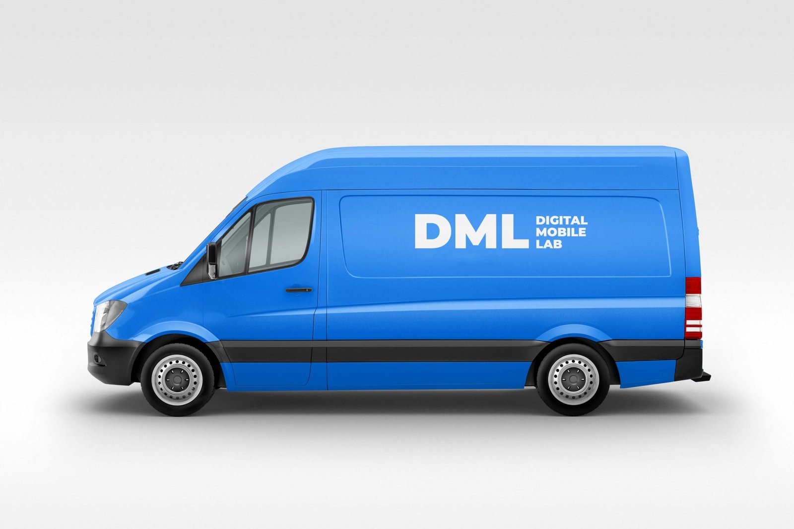
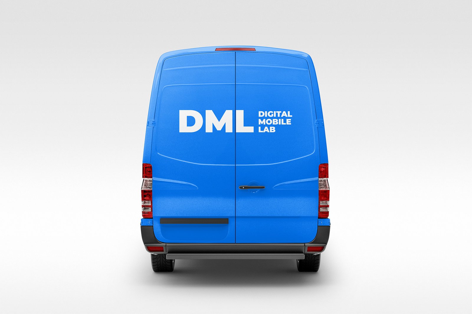
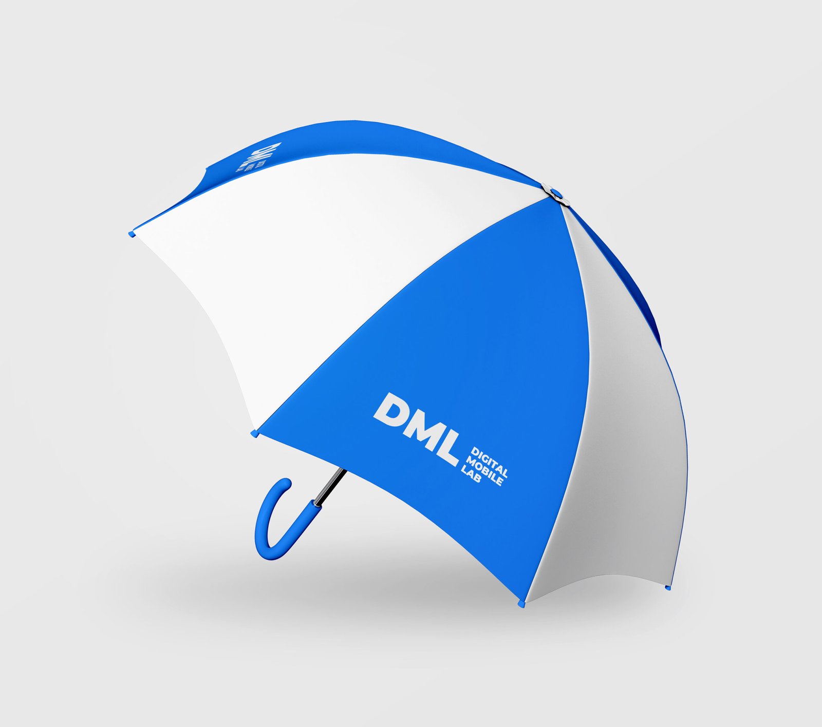
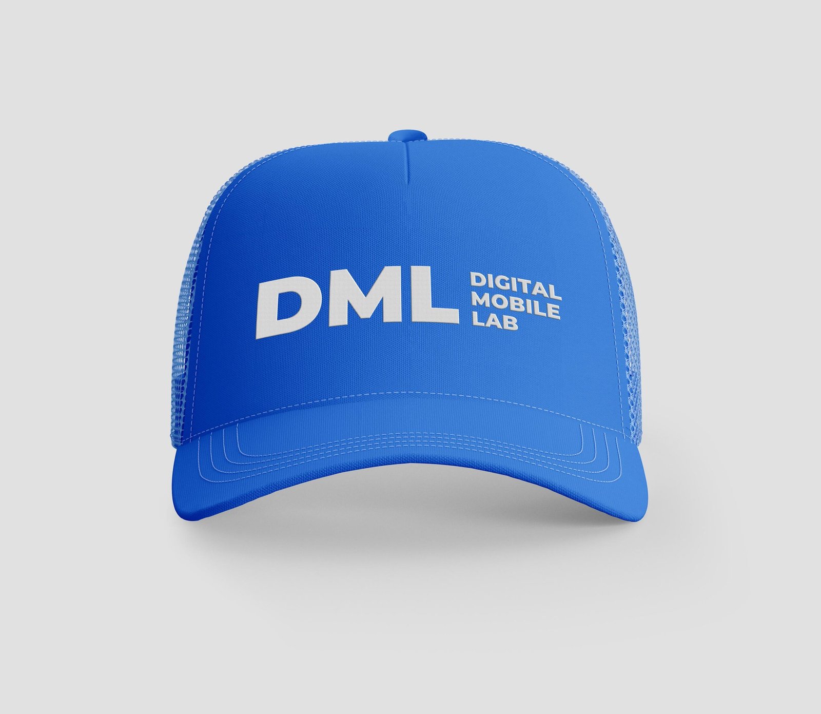
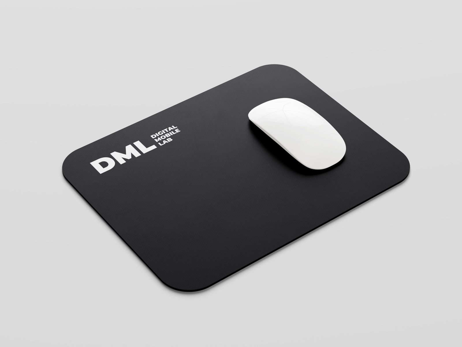
We approached the project from a student’s perspective choosing colors, tone, and symbols that felt modern, engaging, and approachable. Blue was selected for trust, learning, and calmness.
The acronym DML became the centerpiece, supported by the full name for clarity. The identity was designed to feel light, flexible, and scalable across learning materials, presentations, and digital platforms.