Industry
Consumer Packaged Goods
Project
Visual Identity & Packaging Design
Core Audience
Everyday dairy consumers and increasingly eco-conscious shoppers seeking fresh, accessible and trustworthy products.

Made to stand out and win attention on the shelf

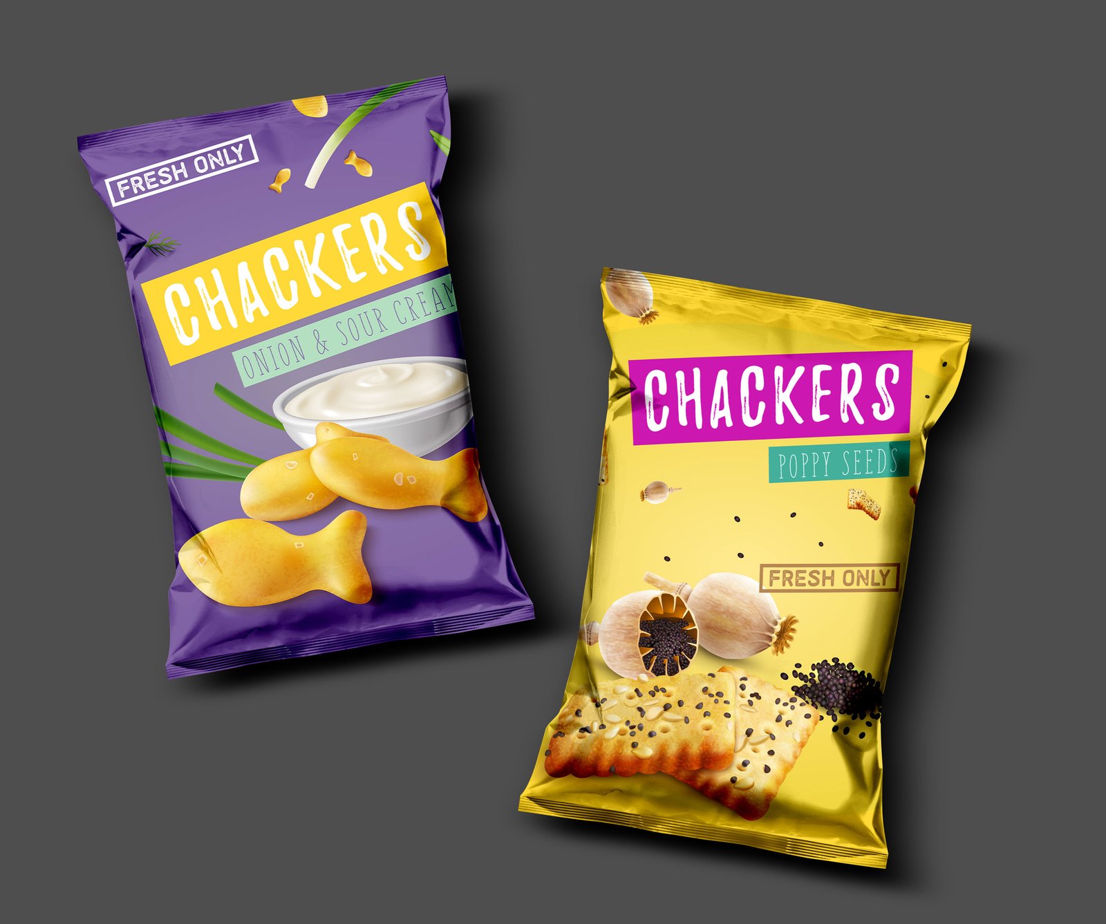
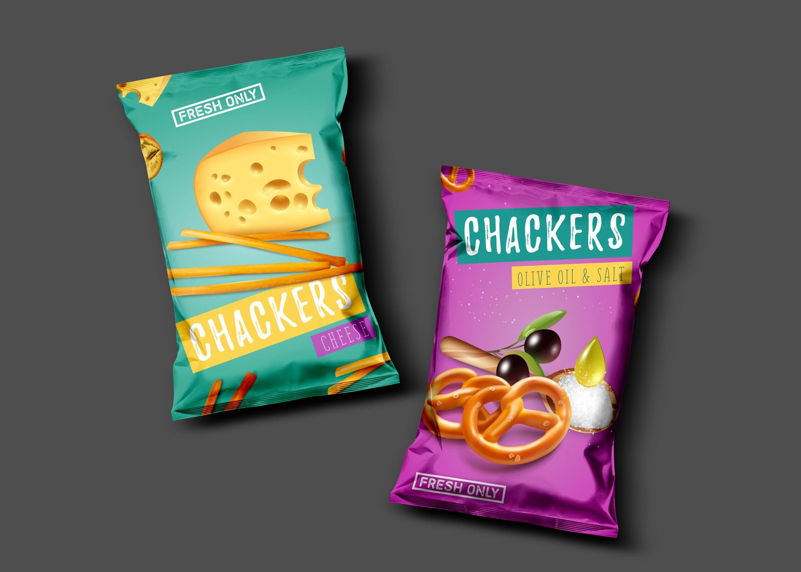
Chackers needed to stand out on a crowded dairy shelf. Its existing packaging lacked the visibility and energy needed to capture attention, while doing little to communicate the brand’s focus on freshness and growing commitment to sustainability.

The challenge was to create a stronger shelf presence without losing the familiarity of the brand.

Our Approach

We focused on three key principles: clarity, contrast and shelf impact. The existing visual language was reassessed through the lens of how consumers encounter the product at first glance, what they notice, what they recognize and what makes them choose.

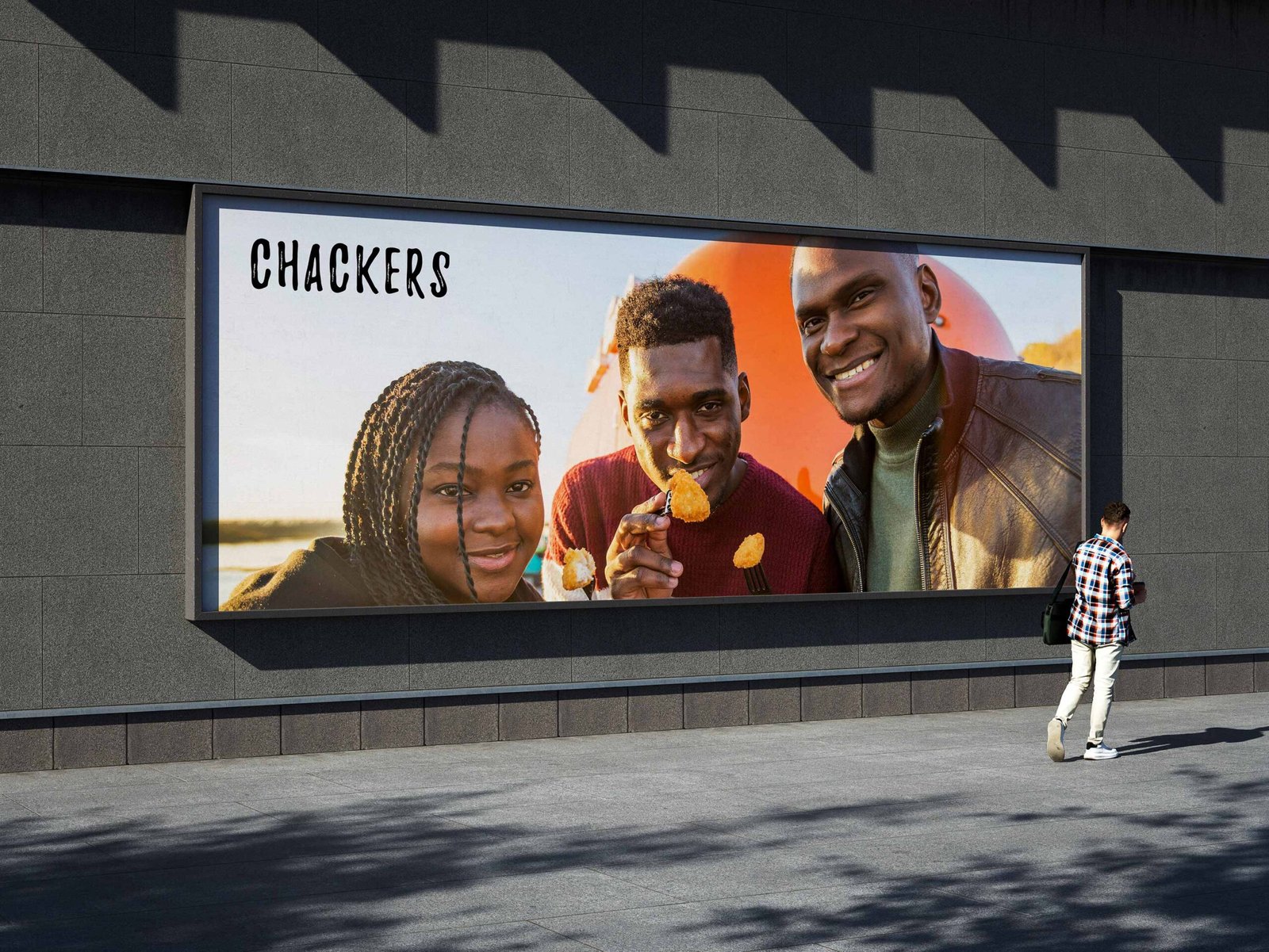
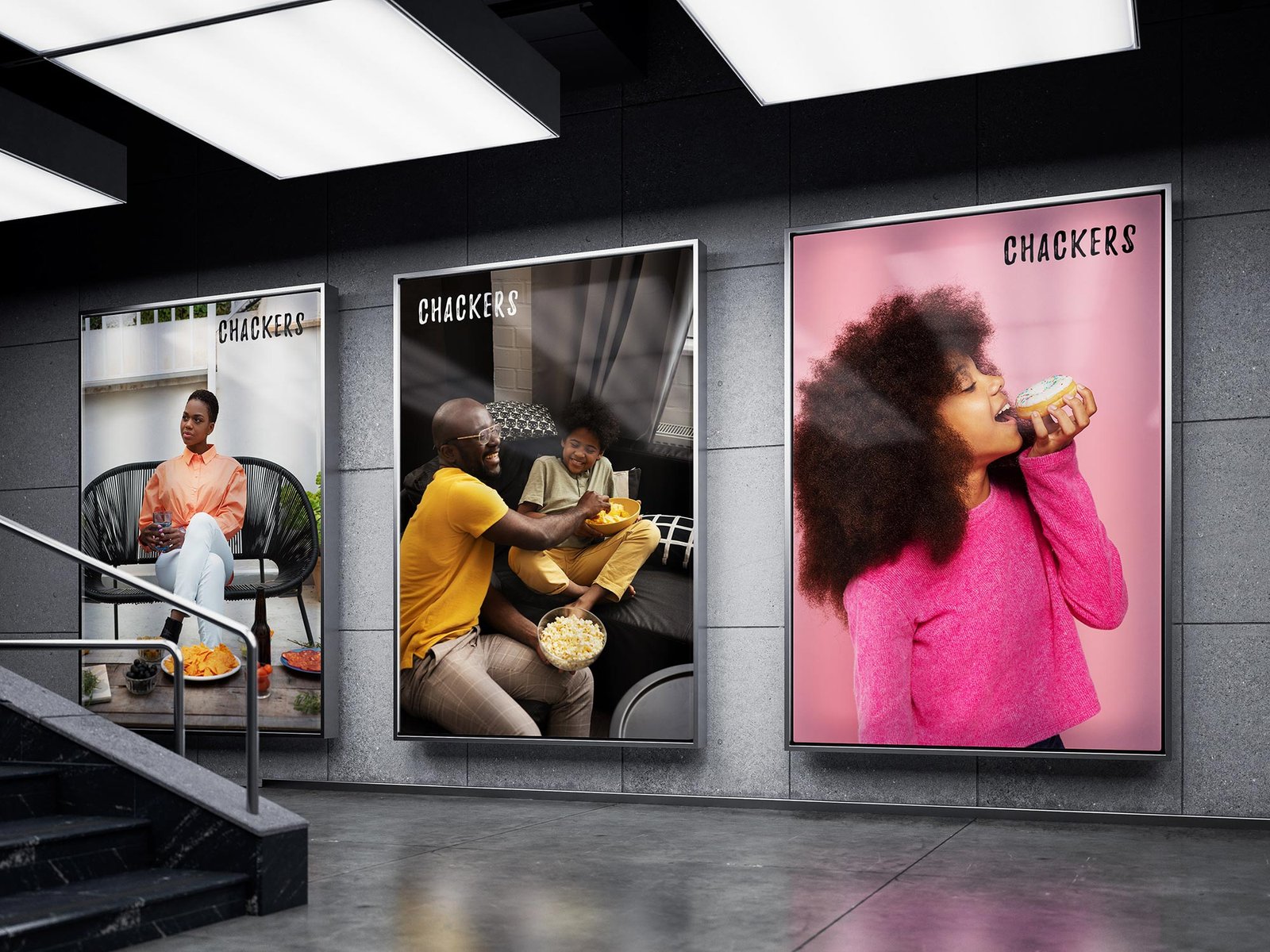
A refreshed logotype was developed to strengthen recognition, while colour psychology, composition and hierarchy were carefully considered to create greater visual impact.

The Solution & Results

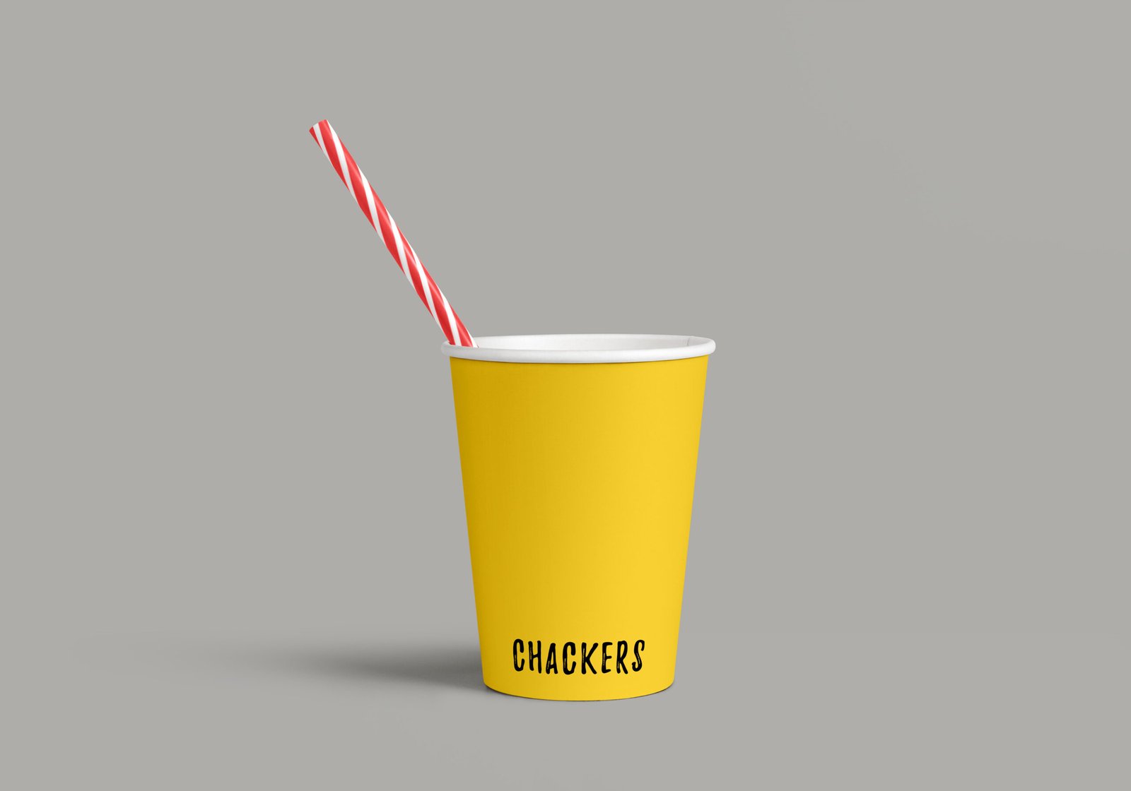
We created a more distinctive packaging system designed to command attention and communicate freshness instantly. The refined logotype improved brand recognition, while a stronger colour and layout strategy gave Chackers greater presence across the shelf.

The packaging was also transitioned to sustainable carton-board materials, bringing the physical experience closer to the brand’s evolving environmental values without compromising its visual appeal.

The result: a fresher, more visible and purposeful expression of Chackers, built to compete for attention while moving the brand towards a more sustainable future.

© 2022 – 2026

All rights reserved