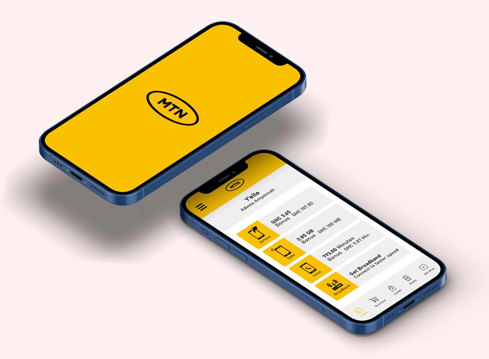
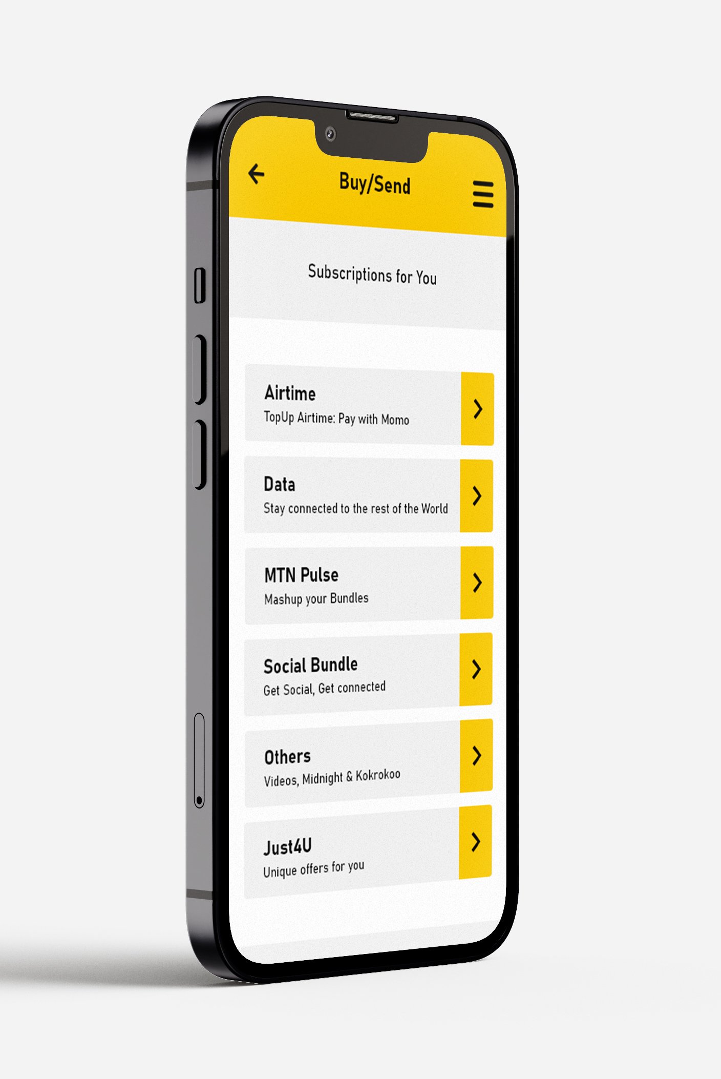
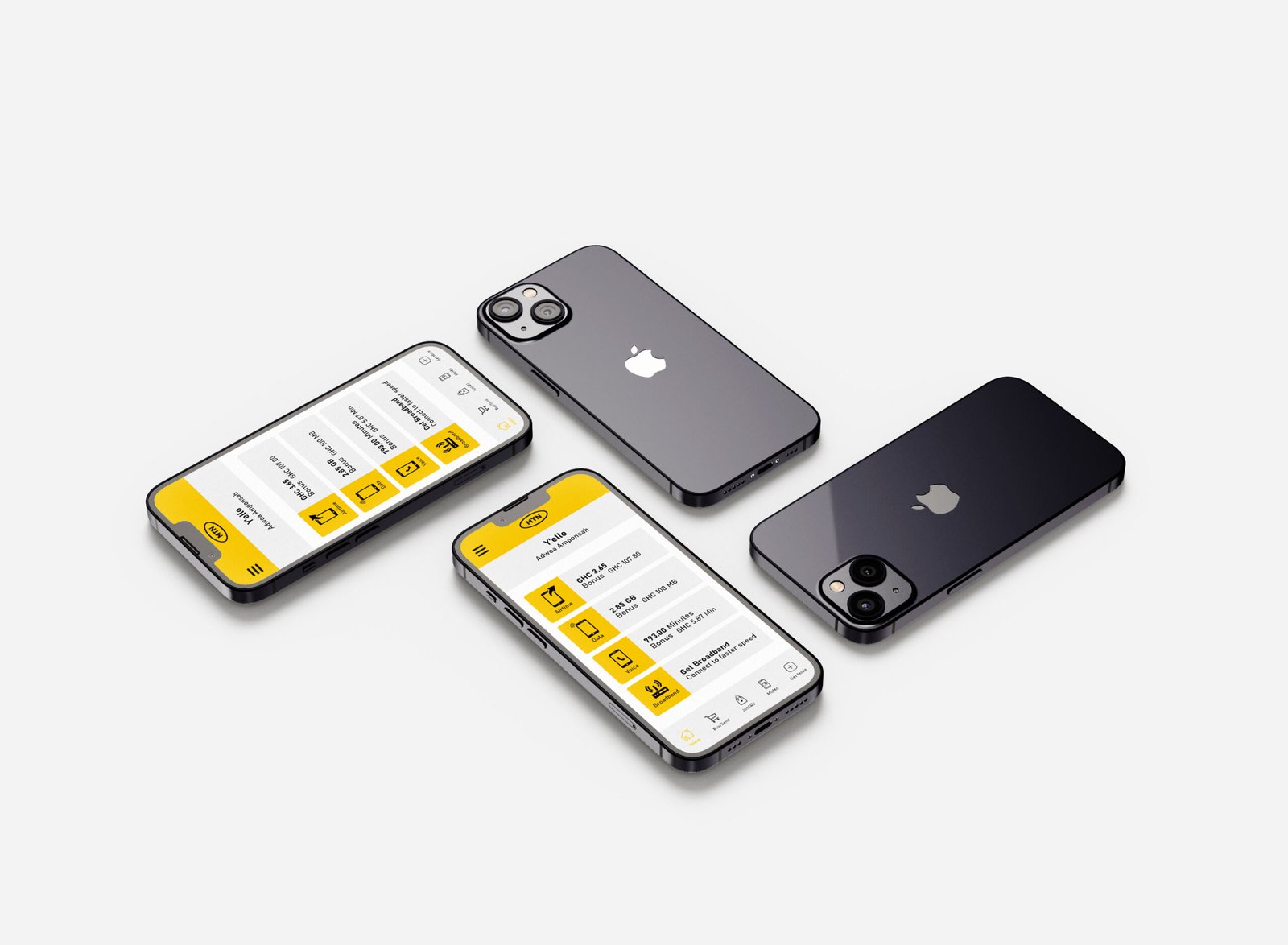
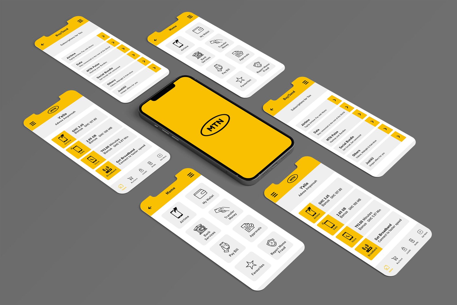
The redesign focused on one clear principle: make everyday transactions simpler. Core actions such as Send, Receive, Pay, and Withdraw were prioritised through clearer hierarchy, simplified layouts, intuitive iconography, and more consistent interaction patterns, while retaining MTN’s familiar yellow, black, and white visual language.
Prototypes were tested against real Ghanaian usage scenarios, including low-connectivity environments and varying levels of digital literacy, helping refine the experience around how users actually navigate and complete tasks.
The result is a clearer, faster, and more familiar Mobile Money experience, simplifying the transaction while strengthening user confidence and trust.