Chackers

Industry
Consumer Packaged Goods
Date
March 2023
Technology
Adobe Creative Suite

Made to stand out and win attention on the shelf

Chackers needed packaging that could break through a crowded dairy shelf and immediately catch attention. The existing look lacked visibility and did little to communicate freshness or the brand’s growing commitment to sustainability.

Our Approach

We focused on clarity, contrast, and shelf impact. A refreshed logotype was developed to improve recognition, while color psychology and layout were carefully considered to draw the eye at first glance. 

Sustainable carton-board materials were introduced to align the brand with eco-conscious values, without compromising visual appeal.

The Solution & Results

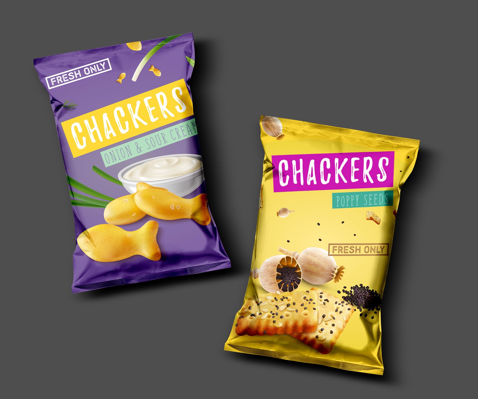
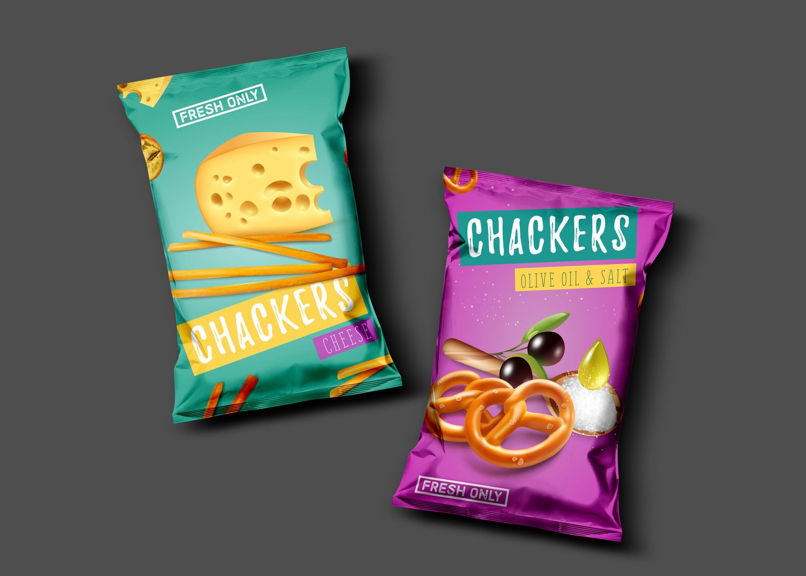
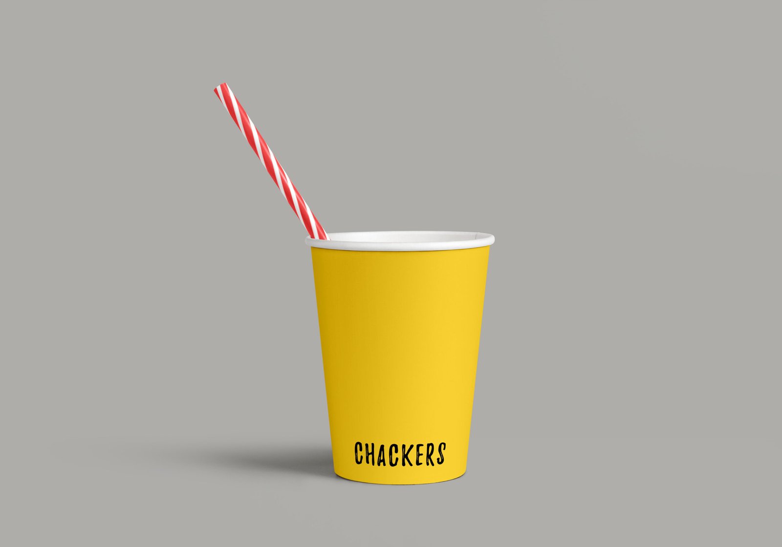
The new identity gives Chackers a confident shelf presence. 

The packaging is clean, eye-catching, and easy to recognize, clearly communicating freshness and environmental responsibility.

Chackers now connects more strongly with modern consumers and stands out in a competitive category.

© 2022 – 2026

All rights reserved by Brand Gap