We built TPDA around a simple, purposeful idea:
Growth is a journey.
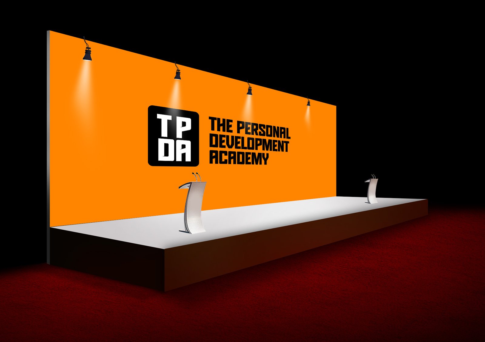
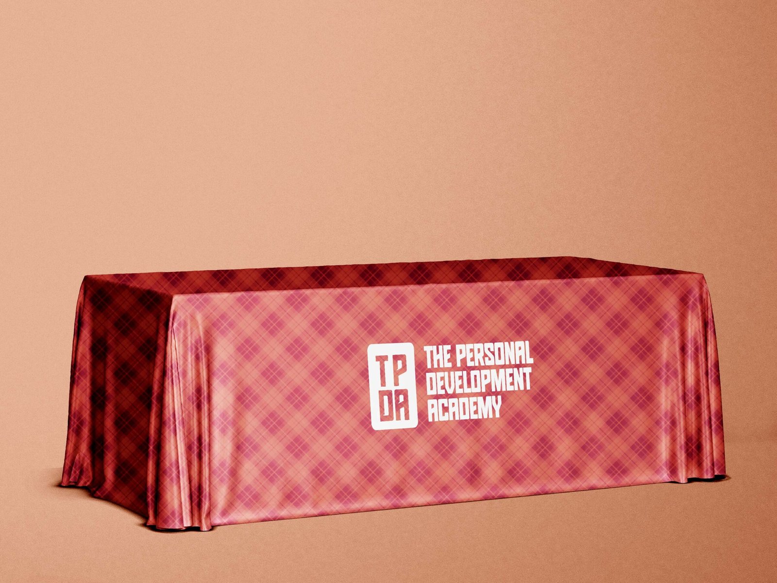
The identity translates this idea through a bold, energetic and approachable visual language. The TPDA monogram was developed as a distinctive, compact mark representing structure, unity and upward movement, while the typography and colour system give the brand confidence and contemporary energy.
The identity was then extended into a human-centred digital experience, designed to clearly communicate TPDA’s value, showcase its programmes and guide audiences towards enrollment.
Rather than presenting education as an end in itself, every touchpoint was designed around transformation, helping people understand not only what they can learn, but how that learning can help them grow, develop and become better equipped for life and work.